The Problem
Most QR generators will happily hand you a code that does not work. You pick a nice gradient, drop a logo in the middle, turn the background transparent, and the tool exports it without comment. You find out it fails when it is already printed on five hundred flyers.
The failure is quiet, which is what makes it expensive. A code that scans on your desk under good light can fail on a poster in a stairwell. Designers are making calls about contrast, quiet zones, and error correction without being told those things exist.
What We Did
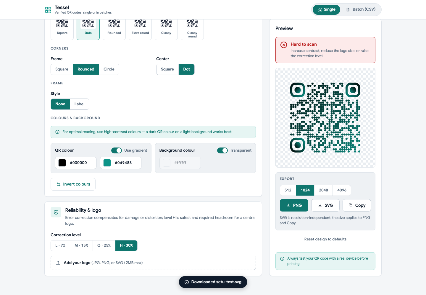
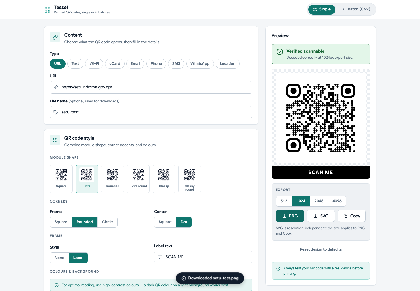
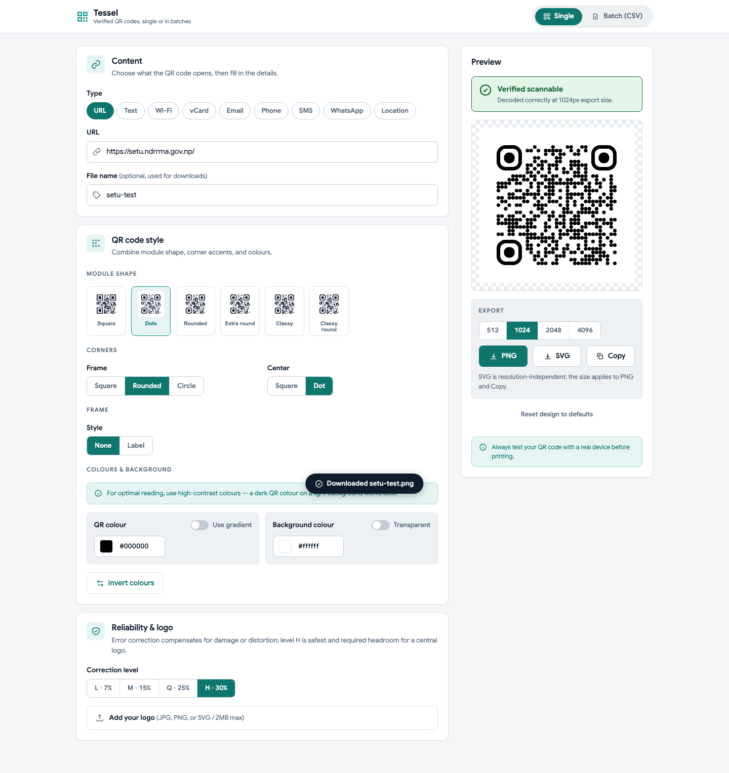
We made the verification badge the hero of the interface. Every code is decoded in the browser with ZXing before you can download it, and the badge says plainly whether it scans. Get it wrong and it turns red with the reason — increase contrast, reduce the logo size, raise the correction level. It is the same feedback a printer would give you two weeks later, moved to the moment you can still act on it.
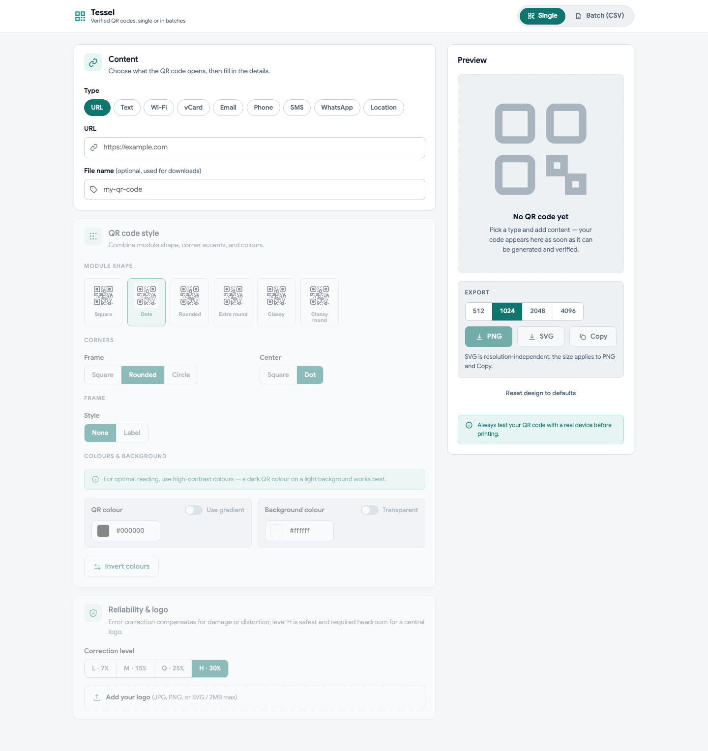
Once the badge is the promise, everything else has to hold it up. The download buttons stay disabled while the badge cannot vouch for the output. The style controls stay dimmed until there is content to style, because there is nothing honest to preview yet. Batch runs verify every row individually instead of assuming the design carries over, and changing the design afterwards resets those marks rather than letting them go stale.
The constraints are enforced rather than documented. Quiet zone stays at four modules per ISO/IEC 18004, computed from the actual symbol version. Logos cap at 40% so the highest error correction level can still recover what they cover. Inverted and transparent codes raise a warning, because both are common and both break scanners.
One decision shaped the visual side. The dot module style everyone wants renders the three finder corners as clusters of dots, and ZXing cannot reliably detect those — the code looks great and scans badly. So the data modules render as dots while the finder corners stay solid. Same look, and it actually works.
A fair amount of the work was subtraction. Dark mode got built and then removed, because a QR generator’s entire job is showing you true contrast and a dark chrome fights that. The product started as QR Studio and became Tessel. Typography collapsed to one family with weight doing the hierarchy.
I built this with heavy AI assistance, which is worth saying plainly. It let a designer ship a working tool instead of a spec — but every decision above is a design call, and those are the ones that make it useful.
The Result
Live at manishrajsilwal.xyz/qr-generator. Around 2,800 lines of vanilla HTML, CSS, and JavaScript with no framework and no build step, so it deploys as static files and nothing you type ever leaves your browser.
Nine content types, SVG and PNG export up to 4096px, CSV batch generation that returns a ZIP, and a command-line version that renders and re-decodes every code to prove the claim outside the browser too.